I'd just like to add that well established icons are much more readable than text.
The prime example that makes me believe this is road signs. In Europe it is pretty easy to drive a car in any country and be able to do it correctly, IF you are used to European road signage. Driving a car in USA when used to European signage is difficult. The signs in USA more often have text, but it is not always more understandable than an icon. What does "PED XING" mean, and how much time and energy do you have to dechiffer it while driving? (It took me days to realize that it is probably a contraction of "pedestrian crossing") Another example; it takes much more effort to understand what "SLIDES" might mean than it takes to recognize a pictogram of sliding rocks. When the text is not immediately understandable, you have to recognize it from earlier. This is similar to icons that are not immediately understandable.
My take-away here is that it takes lots of effort to make good descriptive text. Using text instead of icons is not a simple solution for the problem described in the article. It takes effort to communicate clearly anyway :)
So, I think an interesting discussion is what icons have reached that well established status. To me, the power on/off icon seems like one, and the settings gear symbol is rapidly becoming one. The refresh icon of a broken circle with an arrow at one end of the line (see any browser) is also one.
Interestingly, I looked up the power icon and found it's an IEC standard, with variations having very specific meaning[1]. A quick search didn't bring up much more useful, although there's an IEC publication "Graphical Symbols for Use on Equipment" which looked promising (although I didn't see anything useful in the preview PDF I found)
I can give you at least two data points: my parents would have no idea that a line in a circle means "turn this device on."
Most people are trained monkeys. The assumption that anything is universally obvious will almost always be wrong. Being explicit helps people figure things out rather than needing to randomly attempt and see what happens (many will be too scared to try) or ask someone else for help/training.
Text can be beautiful and doesn't need to hurt the design. This is all part of the challenge.
And yet text is necessarily limited in it's audience, based on the people who can read it.
Every physical electronics device that I've seen and has a power related button and was created within the last 5 years has had the IEC standard button.
At a certain point this is a training issue. I think universal symbols have value. If we can standardize on a few for extremely common concepts, I think it's worthwhile to do so and train those that don't know them.
The radioactivity hazard sign[1] is a good example of this. At one point (prior to 1946), people didn't know what that meant, but people learned because there was value in knowing.
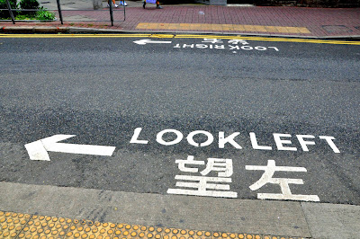
I can think of one situation where the text is counterproductive, for me at least. Where I live, the direction of oncoming traffic is written on the road for pedestrians. There's also an arrow.[1]
The problem is that once I'm halfway across the road I can't help but read the upside down text in front of me, which is telling me to look in exactly the wrong direction. Clearly I already know which way the traffic is coming from, but it's not helpful to see an arrow pointing left and reading "look right".
Most signs also have a symbol as well. PED XING signs will have an image of people in a crosswalk. It takes exactly no time because the signs are fairly standard and we, in the US, are used to it. It's the non-standard signs that take time to parse.
The road signs in the US are _well established_ in the US.
> The road signs in the US are _well established_ in the US.
Of course they are! I am not trying to say that US signage is unclear. I am trying to illustrate that it does not automatically make things clearer if you use text instead of pictograms. Using text might make things clearer, but "SLIDES" is only clear if you already are familiar with it. Agree? :) (The same thing goes for the text "PED XING", but this example is less important since, as you say, it is usually accompanied by a pictogram)
In my experience, road signs in the US rely much more on text than road signs in Europe. This is why I brought this up as an illustrative example that text is not a magic bullet :)
It might not automatically make things clearer, but if it does then it is better and considering the USA is mostly English speakers it shouldn't be a problem. I can see how the language barrier can be an issue in Europe though.
The prime example that makes me believe this is road signs. In Europe it is pretty easy to drive a car in any country and be able to do it correctly, IF you are used to European road signage. Driving a car in USA when used to European signage is difficult. The signs in USA more often have text, but it is not always more understandable than an icon. What does "PED XING" mean, and how much time and energy do you have to dechiffer it while driving? (It took me days to realize that it is probably a contraction of "pedestrian crossing") Another example; it takes much more effort to understand what "SLIDES" might mean than it takes to recognize a pictogram of sliding rocks. When the text is not immediately understandable, you have to recognize it from earlier. This is similar to icons that are not immediately understandable.
My take-away here is that it takes lots of effort to make good descriptive text. Using text instead of icons is not a simple solution for the problem described in the article. It takes effort to communicate clearly anyway :)